
Showing up professionally, from anywhere
How a pandemic-era prototype grew into a cross-platform presence tool, and what it took to make it reliable, habitual, and genuinely part of people's daily workflow.
Role
Senior Product Designer
Platforms
Mac · Windows · Web
Scope
Core UX · Retention · Integrations
Status
Shipped & iterating
Key results
Sidebar control adoption (vs 10% target)
Success users
App quits
About 
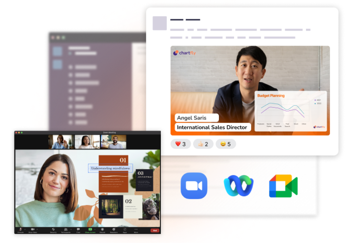
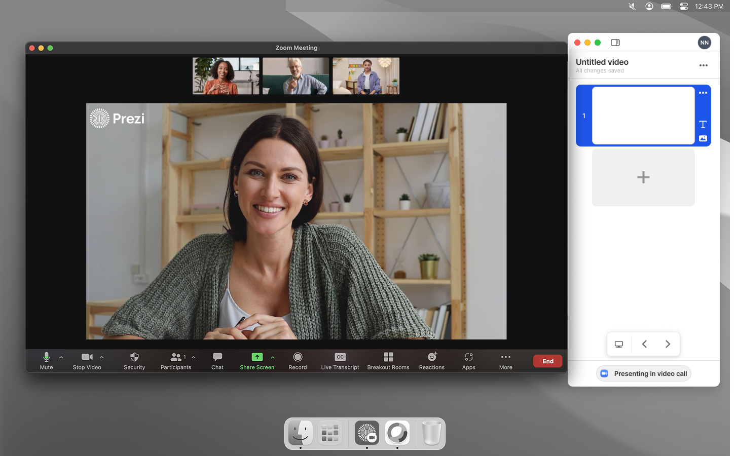
Prezi Video lets presenters appear alongside their content in a video call, the way a TV presenter appears with graphics on screen around them. It works across Mac, Windows, and Web, and integrates with Zoom, Teams, and Webex.

From live audience to virtual conference room
Remote work changed everything overnight.
When remote work became the default in 2021, the problem wasn't just that people were working from home. It was that the tools available made them look like they were working from home: static webcam boxes, unprofessional setups, no sense of presence.
Prezi Video launched into that moment. The idea was simple but meaningful: let users appear alongside their content during a video call, the way a TV presenter appears with graphics behind them.
Every session started cold - the product was useful, but not yet habitual.
Users weren't keeping the app open between one meeting and another. The camera indicator light stayed on whenever the app was running. Users didn't want to feel observed while they worked. So they quit the app after each session, which meant re-opening and re-configuring before every call.
Presenting during a live call is already high-stakes. Every extra step between "I want to use this" and "I am using this" was a drop-off point.
If the app launched itself and stayed out of the way, retention would follow.
The opportunity was to remove every friction point between wanting to present and actually presenting:
How do we get people into the app and reduce the number of shut downs?
We identified two initiatives that directly addressed this:
Auto-launch
Prezi Video starts automatically when a user joins a video call, removing the manual setup step entirely.
Camera deactivation
The camera turns off when the app is inactive, so the indicator light goes off between meetings. Users no longer have a reason to quit.
Auto-launch: from hackathon to production in three weeks (Mac & Windows).
On Mac, the auto-launch feature went from prototype to shipped in three weeks. The design challenge wasn't the feature itself - it was making the launch feel seamless rather than intrusive.
Windows followed. Because Windows accounts for significantly higher platform volume, the impact was proportionally larger: video minutes up 20% week-over-week after launch.
Camera deactivation: solving the reason people quit.
The camera indicator light was a specific, identified reason users quit between sessions. Once I designed the camera to deactivate when the app was inactive, we saw app quits drop by 12 percentage points - which directly translated into more sessions per user.
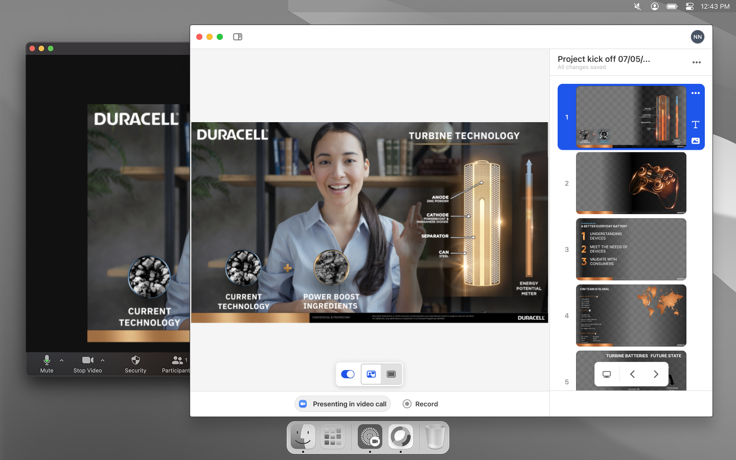
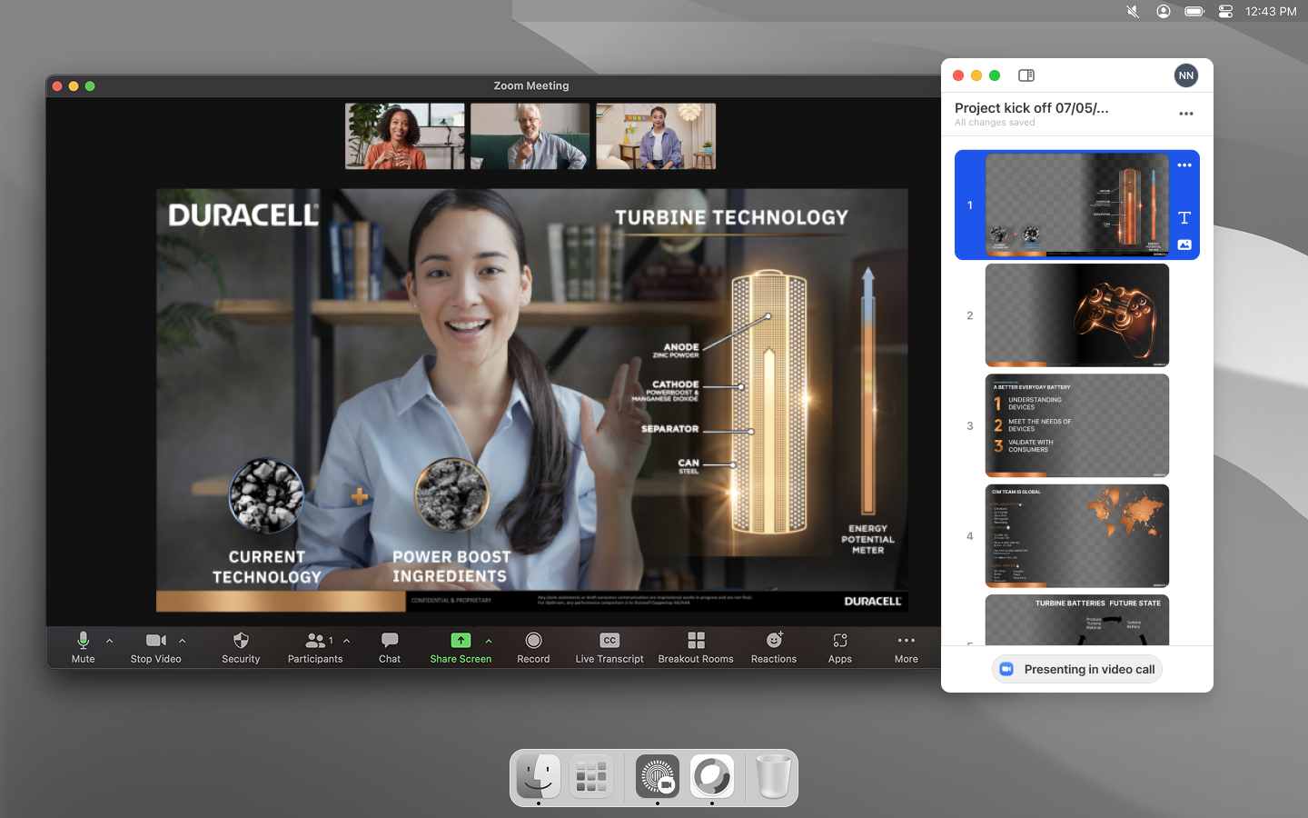
The in-meeting experience
Controls that stayed out of the way.
As the product matured, the question shifted from "how do we get people into the app?" to "how do we give them more reasons to stay in it?"
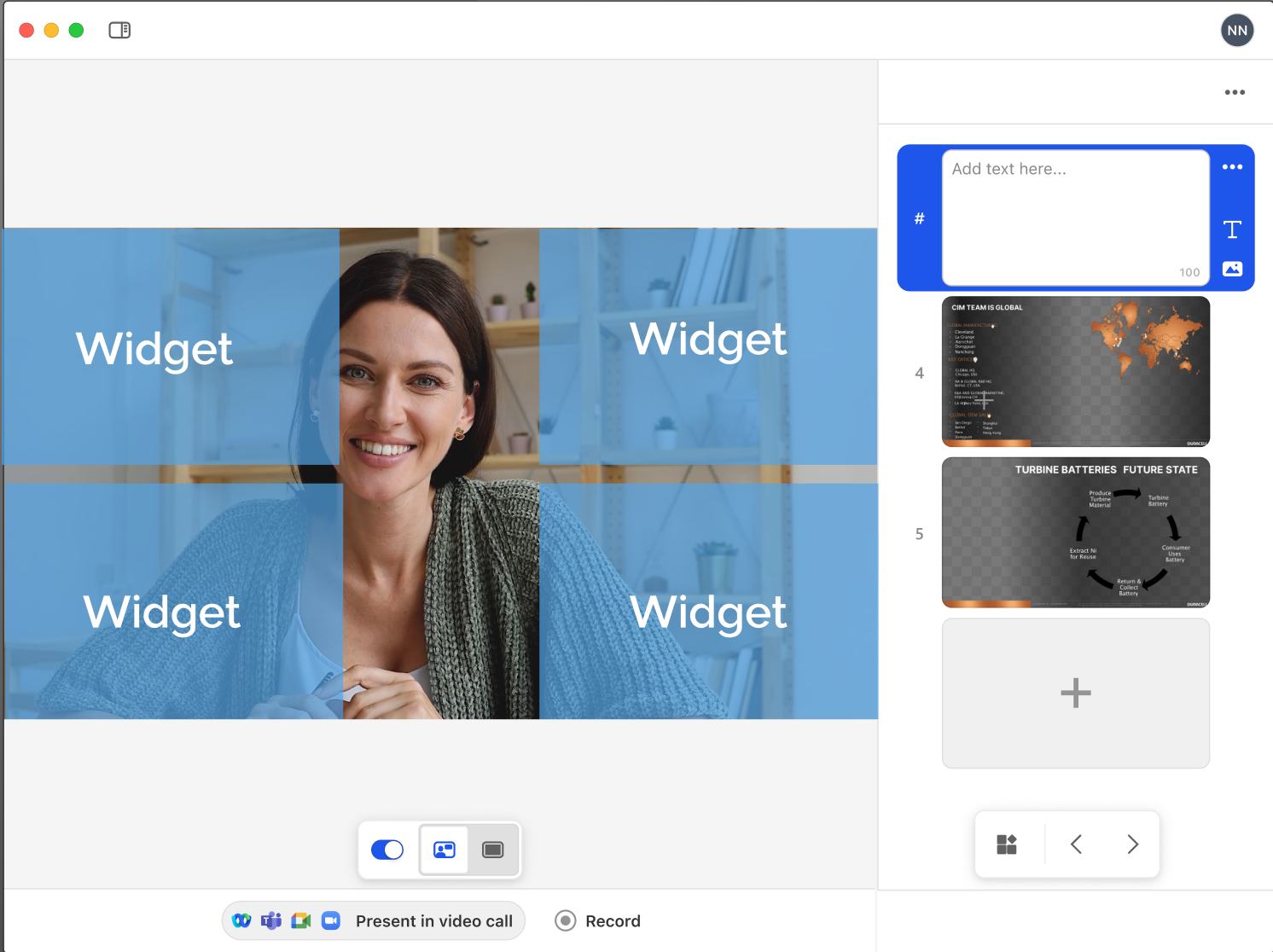
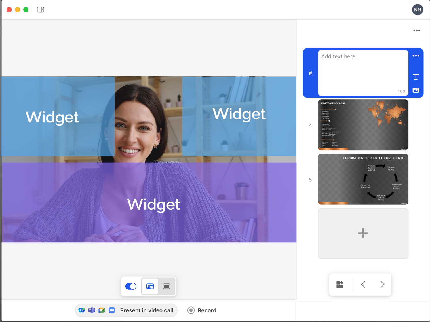
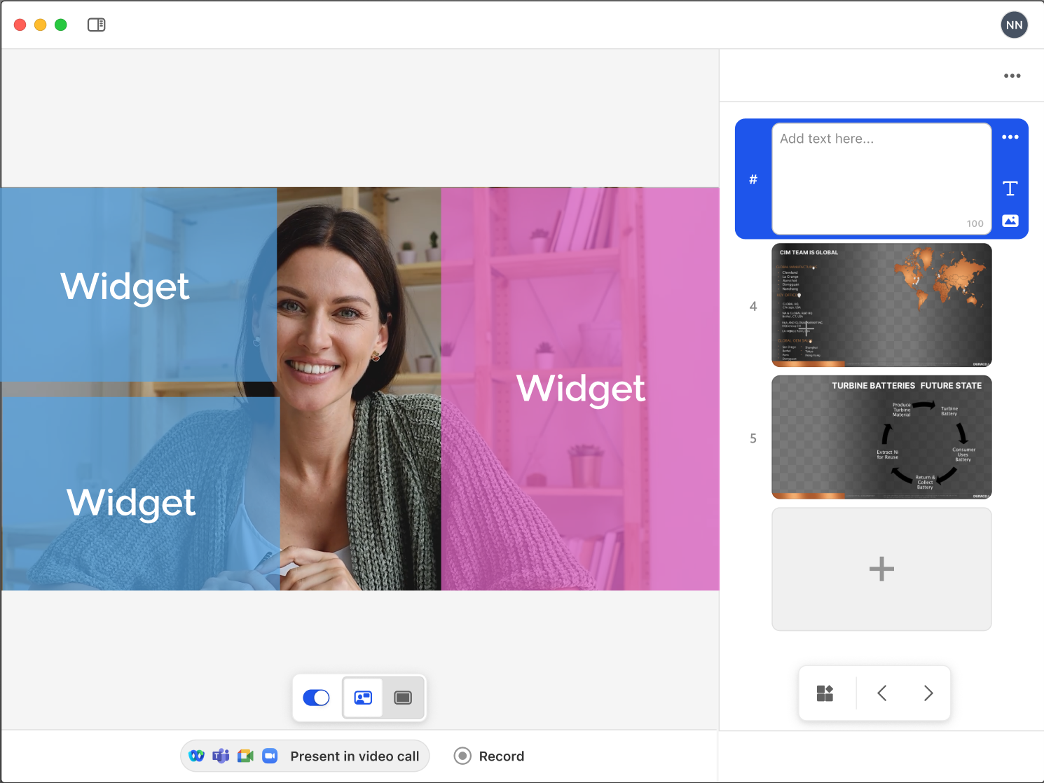
The sidebar was the answer to that question. It needed to be powerful enough to be worth using - playback controls, slide navigation, quick access to settings - but unobtrusive enough that it didn't become another thing to manage during a call.
A presenter's attention during a live call is split between their content, their camera, and their audience. Any control that required focused attention was a control that would get ignored.
After shipping, 57.2% of users who interacted with playback controls used the sidebar version - against a target of 10%.


Details that built trust
Name tags and camera UX - invisible when right, painful when wrong.
Background images weren't filling correctly behind name tags. Company logos were appearing misplaced. The name tag clashed with content when templates were flipped.
These weren't headline features. But they were the kind of friction that makes a product feel unpolished - and unpolished tools don't get used in high-stakes situations like client calls and company presentations.
I defined the content areas within the app to make sure that the presenter isn't obstructed in the side-by-side view.
What the data told us
Not everything worked - and the honest reads mattered.
One experiment introduced a splash screen to guide web users toward downloading the desktop app earlier in the flow. The hypothesis was that desktop users had better retention, so surfacing the download prompt sooner would improve outcomes.
It didn't work. The variant hurt the success by 18.5%.
Users who chose web experience had already made that decision, and intercepting them mid-flow created friction rather than removing it. We killed the variant and moved on.
This was how the team operated - launch, measure, be honest about what moved and what didn't, use the data to inform the next decision. The splash screen failure directly shaped how we thought about the sidebar - we stopped trying to redirect user behaviour and focused instead on making the path they'd already chosen as good as possible.
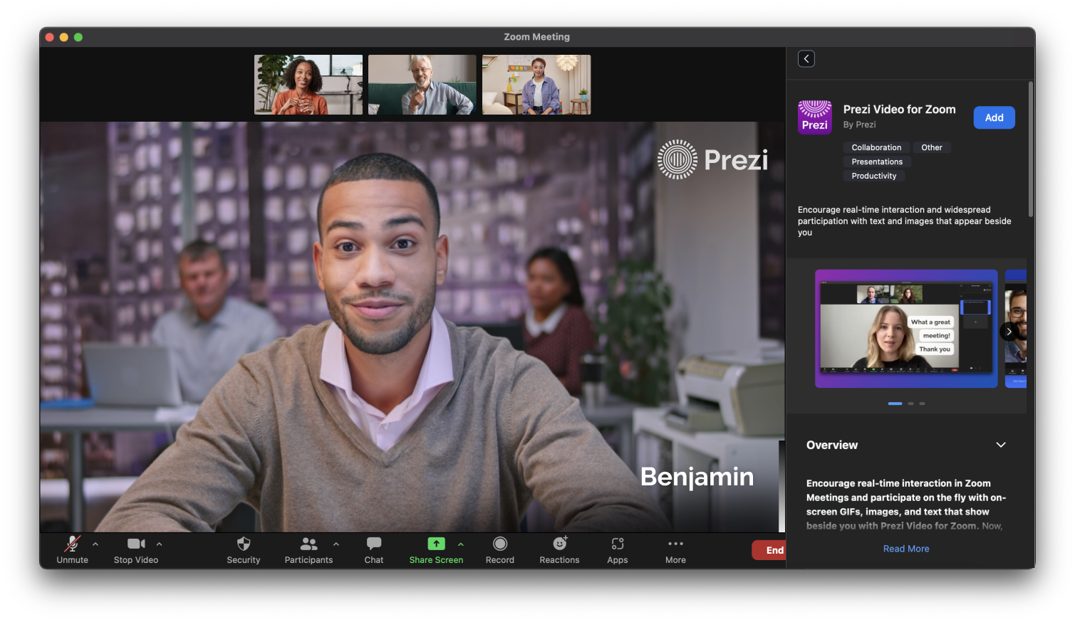
Growing into Zoom
The biggest adoption barrier was always setup cost.
The longer-term ambition was to be inside the meeting itself. I contributed to early exploration of how to bring the core Prezi Video experiences - going live and recording - directly into Zoom workflow, removing the friction of running two apps simultaneously.
Being a native part of the Zoom interface removed the last major setup barrier for the largest segment of video call users.
What I learned
Retention problems are trust problems in disguise.
The camera indicator light seems like a small technical detail. But it was the reason users quit - not because the product wasn't useful, but because it asked them to make a continuous tradeoff they hadn't agreed to.
The auto-launch and camera deactivation work taught me that retention isn't always about adding value - sometimes it's about removing the cost of the value you've already delivered.
The failed splash screen experiment reinforced this. We tried to move users toward a behaviour we thought was better for them. They'd already made a choice. Respecting that choice - and making it better - worked. Overriding it didn't.